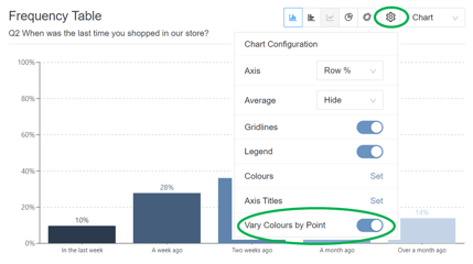
Setting chart colours
Default colours for you bar, pie and doughnut charts are generated from the site’s main theme colour. For bar charts, you can choose to [show all bars – results?] in one colour, or vary the colours by point. Varying the colours by point is the default colour option for pie and doughnut charts.
The option to vary colours can be turned off and on in the settings menu:
To change or add colours, you can go to the settings, find ‘Colours’ on the drop-down menu, and select ‘set’.
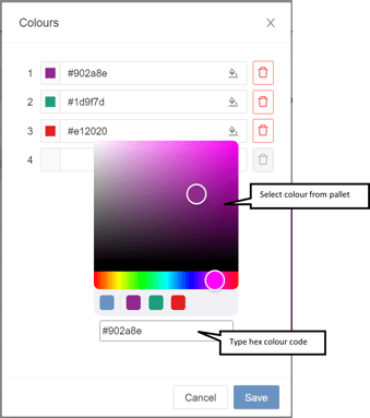
You can then select colours from the pallet, or type the hex colour code for the colour you would like to use, allowing you to more accurately configure the chart to your specific needs or brand colour scheme:
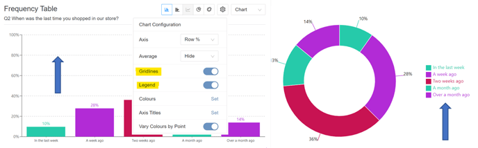
Legend and Gridline Visibility
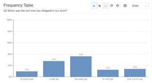
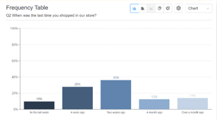
You can choose to show gridlines on your bar charts, to help readers more easily gauge the height of bars, and you can also hide the gridlines to improve readability on a busier chart, where their inclusion might clutter the chart. You will find the option to show or hide gridlines in the settings menu in the top right corner of your NumbersMR chart.
You can also choose to show or hide the legend for charts, depending on report requirements or preferences. This configuration is also found in the settings menu, and in the examples below we have shown the gridlines and legend: