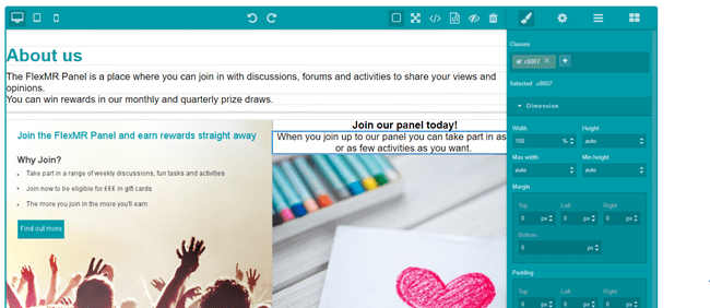
In the top right-hand corner of the pages screen you will see the ‘+ Add Page’ button. To create a new page, click this button - you will be taken to the screen below:
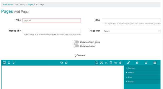
Title and Page Type
When you create a new page you need to give this a title – this will be visible to participants who view the page and also in the footer of the site if you choose to add the page there.
There are three types of pages you can create:
- Default
- Cookie Policy
- Terms and Conditions
Default – You can have as many default pages as you like, and you can choose whether you want these pages to show in the site footer, on the login page, or both.
Cookie page and Terms & Conditions page – You can only have one each of these, as these pages are specifically designed to show on the account set up screens that new participants see when they are joining the site, for example from a recruitment screener survey set to ‘promote account’.
Show in footer – If a page is set to ‘show in footer’ then there will be a link to it in the footer of the site on all screens. The title will show in the footer as a clickable link which takes the user to view the page in a new window.
Show on login page – If a page is set only to ‘Show on login page’ then the page will not appear in the site footer but you can share a link to it with participants in survey questions, from widgets, from news ityems or in task invitation emails. To get the link for your page go to ‘Site content’, ‘Pages’, and then click the screen icon next to the page. You can copy the URL from the address bar of your page.
If a page is set to ‘Show on login page’ AND ‘Show in footer’ then it will appear in the site footer but will also feature in the footer on the login page, so that users who have not yet set up their account for the site can view it. We recommend setting your site privacy policy, terms & conditions and cookie policy to both ‘Show on login page’ and ‘Show in footer’.
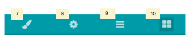
Content Toolbar
The toolbar in the content section of the pages setup contains the following option icons:
Preview the page at different device sizes

Undo/redo

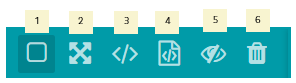
- Toggle component visibility - The gridlines and borders around elements are shown by default. You can use this button to hide these from view.
- View the page in full screen.
- View HTML code – Use this to show the HTML code for the page you have created. You can then copy and paste this into a notepad document and save this outside of the platform to be used as a template in the future if you wish.
- Import HTML code – Use this to copy and paste in HTML code from other pages (step 3) you have saved. Please note, if you import HTML copied from sources other than pages created in the site, they may not behave the same as those created in the pages tool.
- Toggle image visibility – Images which have been added to the page are shown by default. You can use this button to hide the images.
- Delete all: This clears the current page content. Once you have added a new element the previous content is overwritten.
Adding Content
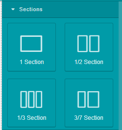
Sections allow you to structure the page – you can nest different section blocks together to get the structure you want.
You can (and should) nest sections one inside the other, e.g. you might have a 1 section container with another 1 section container then a title then a 1/2 section (see example below).
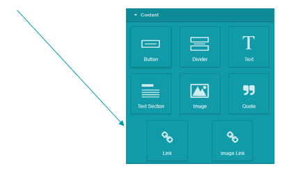
Content
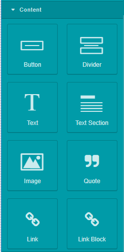
There are blocks for sections (which you use to create the layout); page components such as text; images and text sections; and headers.
Content blocks can then be dragged into the sections.
Aligning content
The best way to align an image is to first create a “Section” component (1, ½, 1/3 or 3/7), then drag an image component into it. Then select the cell containing the image by clicking on it, opening the Style Manager and selecting the appropriate align from the “Text align” section of the “Typography” menu.
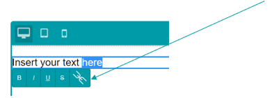
Creating text boxes
Pasting text can be performed by first dragging a “Text” component into the editing area, double clicking its text to activate “edit” mode and then pasting content into it. To make sure you don’t retain unwanted formatting, you might want to copy and paste via a text editor like Notepad first.
Lists
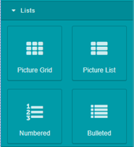
There are 4 types of lists: picture grid; picture list; numbered and bulleted.
You will probably use numbered and bulleted most.
Headings
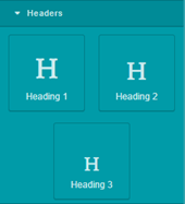
Headings can be added to create sections. The available heading levels are H1, H2 & H3.
These will default to your site’s main theming colour but can be changed in the Style Manager. H1 is the biggest and H3 is the smallest.
Formatting
To change the formatting on each element, you need to select that particular element and apply the formatting you want. Click on the ‘formatting’ button to open the formatting menu
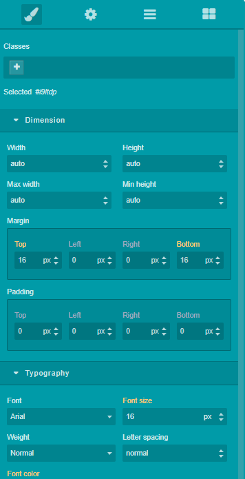
Changing the size of content or blocks
You need to make sure you use ‘px’ after the width or height. Click into another block after you’ve finished editing a setting for it to update.
Creating links
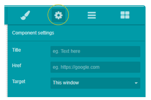
To create a link please double click in the text box to ‘activate’ that section, then select the text you want to use for the link. A box will appear next to it, with five formatting buttons. The rightmost one will turn the selected text into a link.
To configure the target for the link use the “Options Manager” (cogwheel button in the top right corner). Then click the link text and the fields below will open up in the Options Manager where you can enter the link URL and choose whether you want this link to open in a new window or the same window.
Alternatively, a “Link” component can be dragged into the body of the page from the content sections.
Editing Content Blocks
When you select a block of content – e.g. an item in a list, a block of text or a section heading, you have a bunch of options:
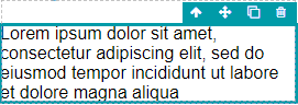
 Select the next level up/container
 Move element
 Clone element – this is particularly useful for adding extra items to bulleted/numbered lists
 Delete element
Publishing Your Page
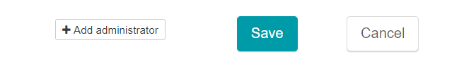
When you have finished creating your page, scroll to the bottom of the screen where you can save or cancel the changes you have made.
Any users who have client accounts and have been delegated rights to the pages section can add new pages and edit/remove existing pages. If, however, you wish for a client user who does not have rights to all the pages to view and edit the page you have created, you can add them as an administrator here.